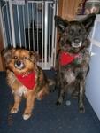
Dear Karen, I really like that each cat's name and information is there with the photos. That is a real aid in remembering and finding any particular one.
I also like that on the Cat of the Day page, at the bottom there are the small photos of the previous week's cats, and the name comes up when you hover over the picture.
Something I would like: at the top of the Pet Talk Forum pages, there are small photos of today's Dog, Cat, and Pet. It would be nice if the name of each was with each photo. Also with the photos of Yesterday's Cat, Today's Dog, and Today's Pet on the COTD page (and corresponding photos and pages on DOTD and POTD).
Pet Talk is an absolute treasure, and you and Paul do a fabulous job with it, Karen. THANK YOU BOTH SO VERY MUCH!!!!!

Last edited by phesina; 07-29-2013 at 05:21 PM.
I meant," said Ipslore bitterly, "what is there in this world that truly makes living worthwhile?"
Death thought about it.
CATS, he said eventually. CATS ARE NICE.
-- Terry Pratchett (19482015), Sourcery


 Reply With Quote


Bookmarks