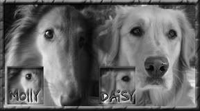
I love it!!!!!!
Alright, I really do like it but.....
I don't think that I would have noticed, but since you mentioned it. Is it hard to remove the hearts just to see what it looks like?
One more thing. I like the script on flicka's name, but I just wanted to make sure that's an 'a' on the end of her name and not an 's'
Edit:
Until I hear from you I am going to make this one my sig.
Thanks,
Bryan


 Reply With Quote


Bookmarks