


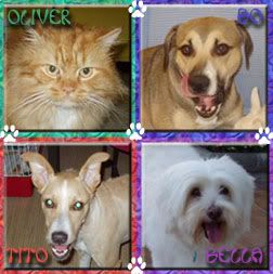
I would change the picture of your pup, IMO its not that great of a shot.
I love the name of your company and the graphics look great.

 Registered User
I would change the picture of your pup, IMO its not that great of a shot.
I love the name of your company and the graphics look great.
I'm not a spazmo, Vyvyan!

Thanks for the imput. I actually thought it was one of my better ones but I guess not! I was debating putting one of these up.
http://irridescent.deviantart.com/ar...y-Pet-89593945
http://irridescent.deviantart.com/ar...a-row-79764726
http://irridescent.deviantart.com/ar...Ahead-89595316
Niño & Eliza
Registered User
Overall, a good job, but I would give the text "home, portfolio, pricing" along the path, a little air, so that they're adjusted center with the stars.
I would adjust the bread text left and pull it in to give it the same amount of "air as in the right side. Not sure about the font though.
I agree with Jackie about the photo, it's not that sharp, but otherwise cute. Perhaps if you cropped it slightly more. My other choice would be the first of the three photos.
I like the gradient beam and font. And the colurs are subtle.
"I don't know which weapons will be used in the third World war, but in the fourth, it will be sticks and stones" --- Albert Einstein.
 Posting Permissions
Copyright © 2001-2013 Pet of the Day.com

 Reply With Quote
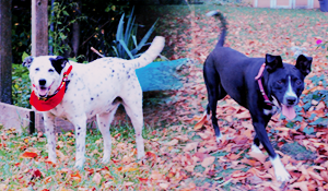
Bookmarks