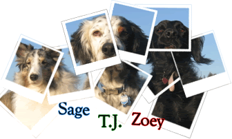
WONDERFUL! It looks fanatastic. You should have gotten a WAY higher grade. Good job Bre!
You can do the animals in letters in Photoshop.
1. First, copy the picture of the animal you want.
2. Type a letter, then select it.
3. Don;t unclick - with the letter still selected choose "paste into" from the file menu - then if you "unlink" the image from the mask, you can use the hand tool to move the animal around inside the letter until you have it position as you'd like.
Originally Posted by Karen
![]()
♥Bri [HUMAN]♥
♥Lily [POMERANIAN], Brennan [APBT], Bailey [APBT/HOUND MIX]♥
♥Tallulah[CALICO], Domino [TUXIE]♥
♥Peach [RAT], Pepper [RAT], Phoebe [RAT], and PipSqueak [RAT]
♥Salvatore [BETTA]♥
“Dream what you want to dream; go where you want to go; be what you want to be,
because you have only one life and one chance to do all the things you want to do.”
In Loving Memory <3
Roxy Lily Brennan
Facebook TigerLily Photography
It looks good. I too have been wondering how to do the animal leters
, thanks Karen.
Rhi *Hooman* Clover *Rottie x ACD* (RIP to my BRD) Elvis and Tinny *The BCs* & Harri *JRT* Luna *BC x*
Here's how I do it in photoshop:
1. Type the letters
2. Paste the image on top of the letters
3. Lower the opacity of the image a little bit so you can see the letters
4. Place the part of the image you want to see over the letter you want it in
5. Raise the opacity of the image back to 100%
6. Go to the layers palette. Press ctrl and click on the letters layer. This should select the letters.
7. Now click on the image layer (don't press down on ctrl)
8. Right click and select "select inverse"
9. Press backspace.
10. Voila!
If you want a "border" around it, you will need to press ctrl and click on the image layer in the layers palette. Then go to edit -- stroke. Select the color you want and select "outside". Enter in a thickness and press okay. Unselect the image.
Now if I was being really critical... as I have had to be in classes that I have taught in Design and Photoshop, I would say that you could have ghousted/faded the background much farther making the dog stand out even more. Also your choice of fonts could have been more interesting and perhaps more legible. You could have also incorporated a drop shadow or outline into it as well. But hey, a B is a good grade!!!![]()
![]()
![]()
Copyright © 2001-2013 Pet of the Day.com
Bookmarks