


Another one of my sketches. This one has turned out really well, my scanner has not done a too bad job on this one.
When viewing it, keep it large and copy and paste it to your computer for best results

I really hope you like it, Anita is one cute dog


 Reply With Quote
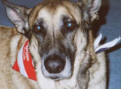


")

Bookmarks