


voted...even though my vote probably doesn't matter.
welcome!

#1
#2
#3
#4
#5
#6
 living by flow of fates..
voted...even though my vote probably doesn't matter.
welcome!
rest and sleep softly sweet locke..

Registered User

#5 grabbed me first
Give £1 for a poundie www.songfordogs.co.uk
Registered User
DittoOriginally posted by aly
I voted for #5 as well... #1 would be my second choice.
- Kari
skin kids- Nathan, Topher, & Lilla
We miss you Angus
Yep, my thoughts exactly.Originally posted by Uabassoon
#5 is the best simply because I can actually see Austin. In the others he blends into the background too much and it's hard to really see him.
I really like the way he looks in #5, his trot and everything.
Good luck choosing!
Huney, Bon & Simba-missed so very much
Remembering all the Rainbow Bridge Pets
& all critters

#3 & #5 are both great!
#3 would be even better if you do his name in another color so it is easier to read as it kind of interferes with his head.
Soar high & free my sweet fur angels. I love you Nanook & Raustyk... forever & ever.
Mom to 8
The thing I don't like about 1,2, & 4, is that the little Austin picture in the lower left corner, covers Austin's nose. It's distracting.
You remedied that in #3, but then Austin is hard to read because it blends into his image.
That's why I picked #5.
~Kimmy, Zam, Logan, Raptor, Nimrod, Mei, Jasper, Esme, & Lucy Inara
RIP Kia, Chipper, Morla, & June
Registered User
Thank you so much everyone, this is a great help. I started off making #5, and i liked it so much, but then then yesterday I didnt like it, so I made all the others. Everyone in my family, except me, liked #5 the best. I guess they were right!! Thank you so much, once again. I think I am going to use #5. I will post a picture of everything together today, or tomorrow. When ever I get things together.
Thank you!
-Beth
DeviantArt
Beth-
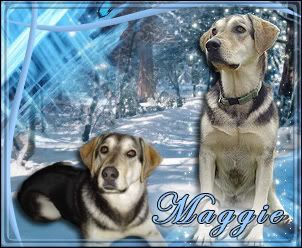
Maggie [lab x germanshepherd], Autumn [Cattle dog x chow], C.P. [Domestic short hair] Henry [domestic short hair] Mittens [siamese/ x ], Buck [paint horse], Indy [Paint horse]
Mayor
I fixed it so now it says #6!
I like the position of the 3 Austin images in #3, but I'd like to see it with background #1, just more subtle. All of the ones with that background have the little horse crossing over the front of Austin's muzzle, and that bothers me!
Registered User
ha! and i proved you wrong! I told you!(if your lost... I told her to pic that one lol)
Sara[human] Maggie[lab/gsd]Autumn[chow/x] Boo Boo[mutt] Mittens[domestic long hair] CP[Domestic short hair] Cisco [Quarter Horse] Austin[Quarter Horse/Paint] and the ducks...
Registered User
Thanks for fixing that Karen!Originally posted by Karen
I fixed it so now it says #6!
I like the position of the 3 Austin images in #3, but I'd like to see it with background #1, just more subtle. All of the ones with that background have the little horse crossing over the front of Austin's muzzle, and that bothers me!
DeviantArt
Beth-
Maggie [lab x germanshepherd], Autumn [Cattle dog x chow], C.P. [Domestic short hair] Henry [domestic short hair] Mittens [siamese/ x ], Buck [paint horse], Indy [Paint horse]
ahwoooo!
heh, I didn't look at the other posts first, and when I voted for number 5 I was surprised to see all the other votes for it too!
I *love* the picture on the right, and I picked number 5 because that picture is nice and large.
Great job, and good luck!
1 girl, 1 pup, 2 guinea piggies, 1 bunny & 1 turtle!
 Posting Permissions
Copyright © 2001-2013 Pet of the Day.com


 Reply With Quote

Bookmarks