Results 1 to 15 of 25

Thread: drawing improvements?

Hybrid View

  1. #1
    Join Date
    Oct 2006
    Location
    midwest
    Posts
    1,078

    drawing improvements?

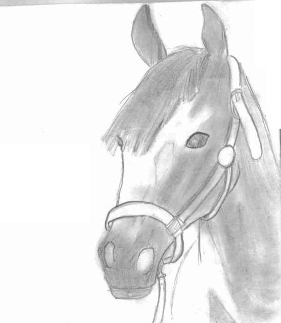
    hey guys! I have really been working on my drawing (horses of course!) and this morning, I finally committed myself to try shading one!


    I know it needs work...but WHERE?! aha please help!

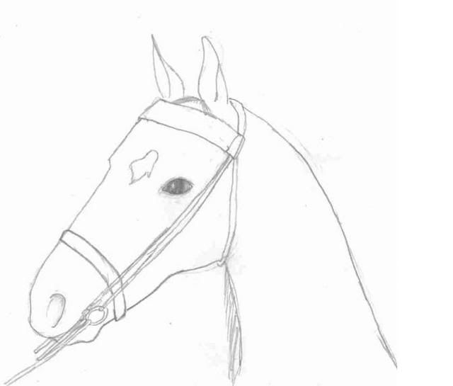
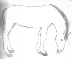
    here are a few more drawings, any critisism is greatly appreiciated!


    (hehe shading didn't work out here :[)


    and what is the difference between a 2H, 2B, and HB pencil? They're what I used, and I've figured out that some are darker and some are lighter, but whats the difference?

    thanks!
    in on the joke and i cant stop laughing

  2. #2
    Join Date
    Oct 2006
    Location
    midwest
    Posts
    1,078
    anyone? i know there are some aamazing artists out there...please help me!!
    in on the joke and i cant stop laughing

  3. #3
    Join Date
    Jun 2000
    Location
    Windham, Vermont, USA
    Posts
    40,861
    2b - the B indicates softness of the "lead" - so a 4B is even softer than a 2 B
    2H - the H indicates the hardness of the "lead" - so a 4H is harder than a 2H
    Hard pencils generally draw lighter, but hold a fine point longer. Soft pencils draw darker, but lose a point very quickly, and the lines get wider.
    HB is in the middle between hard and soft.
    Technical drawings - like an architectural drawing, you need a fine point, so use H pencils.

    Drawings - top one is pretty good - the best of them, I think you need to move the right nostril up and in a little. Oh, and darker in the nostrils - it's dark in there! The next two, the horses' necks are too narrow, wouldn't hold up that heavy head well. The neck on the last one is much more appropriate.

  4. #4
    Join Date
    Jul 2005
    Location
    Ontario/Canada
    Posts
    5,772
    I was going to say the same as Karen about the necks, they look too skinny. And the first one looks like the mouth needs to be fixed like the bottom part. Other then that they look good.
    See ALL my pets here
    Dogs:Pixie.Shrek
    Cats:Milo.Duck.Hank.Molly.Zoe

    R.I.P:Thunder.Rockee

  5. #5
    Join Date
    Oct 2006
    Location
    Sheboygan,WI
    Posts
    75
    Nice but you need to start out drawing lighter,then add the darker pencil to fill in your out line.Have you ever used circles to draw,It helps ...
    Here is what I mean.
    http://elfwood.lysator.liu.se/farp/horses/horses.html

  6. #6
    Join Date
    Oct 2006
    Location
    midwest
    Posts
    1,078
    about the necks - I did all of these drawings from pictures...and that's what the necks looked like. It was like the neck from a front view..and the head turned sideways? idk..but that's what the picture looked like. If I can, I'll put a few of the original pictures up to show you what I mean.

    and yes, I have tried the circles...and it did not work lol. yeah i don't use any circles or anything wierd when I draw the heads lol :]
    in on the joke and i cant stop laughing

  7. #7
    Join Date
    Sep 2005
    Location
    At university in Hertfordshire, UK
    Posts
    4,944
    They're good, you are improving! If I must critique, then this is what I noticed:

    On the first sketch, the outline of the eye is way too dark. Yes, you want the eyes to stand out, but they also have to look part of the face, so shade the eyes more and also shade the area around the eyes. With horses' heads, I often find it useful to try and imagine their skull. If you get a good picture of a horse skull from google, then you'll see all the little convex and concave parts, and these will help you with your shading. Things that are closer to you are darker, things that are further away are lighter.

    I I I I I I I I I


    Here, for example, stare at the above for a few minutes. You should start to see a sort of passageway, as if you are standing near the dark Is and the furthest point is the lightest I.

    I would also say that you are being too neat with your original outlines! I know that's a weird thing to say, but your outline shouldn't be too detailed. Like rutylr mentioned, drawing with circles can help (which is what I do), or simply making a rough outline lightly using your lightest pencil. Your eraser is there for a reason, don't be afraid of using it when your picture starts to take shape to tidy up any loose scribbles.

    Your eraser is also good for highlighting light areas, as remember, unless you are in pitch black (which wouldn't make much of a crawing, lol), light has to be falling somewhere. A stroke of the tip of your eraser can bring out this light and make the picture more 3D.

    Hope that helps! I have a bunch of sketches I'd like to show you as examples on how to improve yours, but unfortunately SOMETHING *kicks scanner* is stopping me doing so.

    Zimbabwe 07/13


Similar Threads

  1. Another drawing *PT dog*
    By slleipnir in forum General
    Replies: 22
    Last Post: 08-01-2006, 12:49 AM
  2. New drawing -WIP-
    By slleipnir in forum General
    Replies: 10
    Last Post: 11-20-2004, 07:12 PM
  3. Pictures of Jasper's skin improvements!
    By DogLover9501 in forum Dog General
    Replies: 16
    Last Post: 09-16-2004, 10:50 PM
  4. New Drawing
    By slleipnir in forum General
    Replies: 15
    Last Post: 04-12-2004, 09:27 PM
  5. New drawing :o
    By slleipnir in forum General
    Replies: 11
    Last Post: 03-23-2004, 04:16 PM

Bookmarks

Posting Permissions

  • You may not post new threads
  • You may not post replies
  • You may not post attachments
  • You may not edit your posts
  •  

Copyright © 2001-2013 Pet of the Day.com